
Monitoring page is dedicated for system measurement analysis for systems with temporary (audit) or permanent monitoring enabled. There are 3 pages : Trend, Analyze and Manual entry.
Inspect
Inspect page is designed for system measurement analysis and data interpretation by experts with 3 main tabs: Trend, Aggregate and Analysis.
Trend
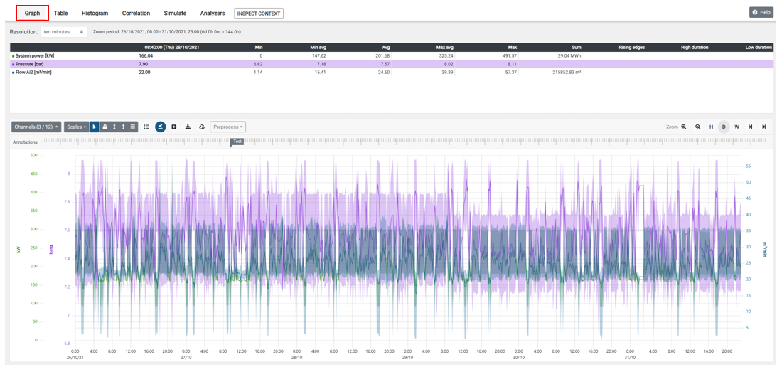
This is the most important page for analysis channels on the graphs with many tools for better and faster data interpretation. All data are shown for inspect period with default sample rate which can be also manually changed for expert users only.
Tools available on toolbar on Trend page
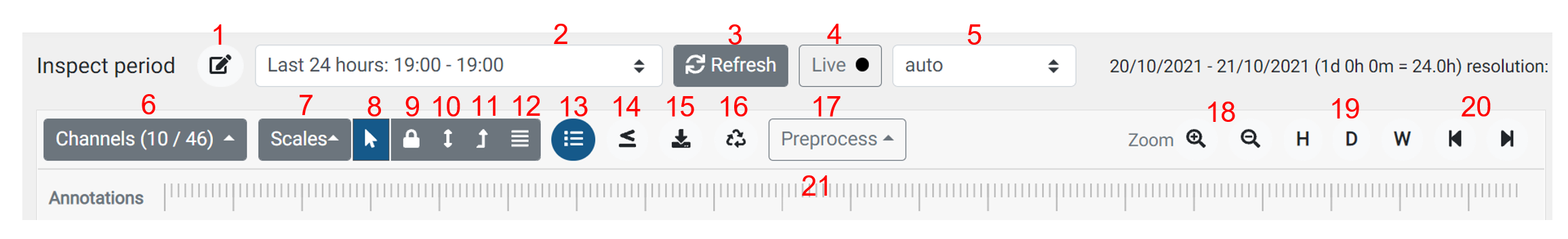
- Inspect period manual selection
- Inspect period predefined selections
- Chart refresh button
- Live - Scope meter with one second data upload interval - only for experts
- Sample rate - automatic based on inspect period, manual for experts only
- Channels selections - indicators, analog, digital measurements
- Scales y-axis manual settings
- Scale y-axis auto change units with cursor position
- Scale y-axis lock at selected ranges
- Scale y-axis zero - max
- Scale y-axis min - max
- Scale y-axis with split channel plots
- Slit charts
- Min-max band - used with higher sample rates charts
- Download plot to jpg or data to csv
- Recalculate data - for expert user only
- Signal pre-process : moving rolling average..
- Zoom in, out,
- Zoom align to Hour, Day, Week
- Slide back, forward for selected period
- Annotation bar - comments, alerts
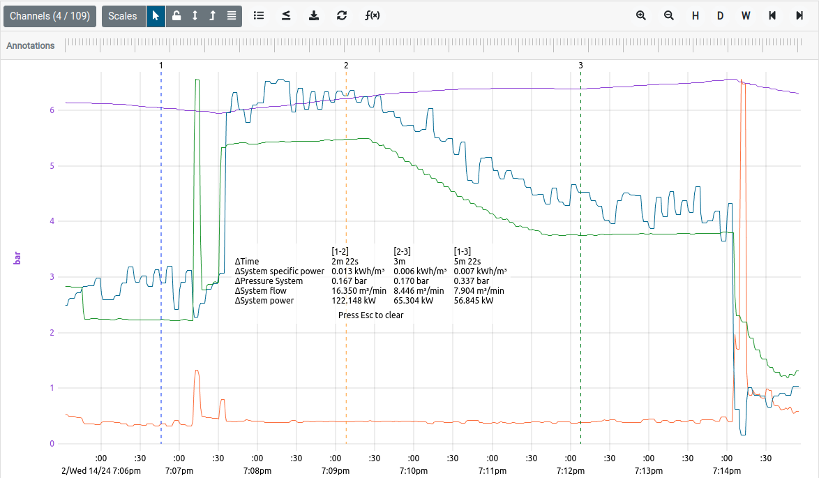
Enhanced Graph Measurement Tool
Graph distance measurement betwen two or three points is very useful feature for finding intervals, time and value difference. When hovering with mouse inside of the graph area you can start pressing keys “1“, “2“ or “3“ to place markers onto the graph at that current cursor position. To clear this display the escape key should be pressed. When downloading the graph picture, measuremens will be included in the image.
- Click with mouse in plotting area to focus
- Use keyboard and press key “1” and “2” up to “3 " to place 2 or 3 measurements at the mouse cursor position.
- Press “Esc” to clear / reset.
Live scope meter
Live scope meter function is working only in systems with CAL-EDGE gateways (rev. 5.07 or higher) and is available only for CALMS experts. Chart will show selected channels with moving graphs in last 5 min inspection window.
Live function will temporarily increase upload rate and enable sample rate of 1 sec, which will increase upload bandwidth used. Function is limited to 30min and must be manually restarted. In standard systems with mobile providers extensive usage might increase data plan cost and temporarily block data transfer due to exceeded monthly limit.
This function is used for compressed air equipment service troubleshooting and remote audits like adjusting control parameters, remote testing of compressor operation with local maintenance person.
Example: Local person will be in call with remote auditor, testing starting-loading-unloading of the compressor, operating at throttle limit, temporarily change control parameters, run specific combination, open bypass valve on air treatment, stop all compressor to check system capacitance, detecting inlet valve or MPV problems, and even to verify local instrumentation with monitoring values …
On the right side of inspect/trend page you can select between Summary and Aggregate which is automatically calculates most important system channels with min, average and max values for selected inspection period.
Summary card
Summary card is showing most important statistical data for selected inspect period based on measurements sample rate and system efficiency compared to the best in class.
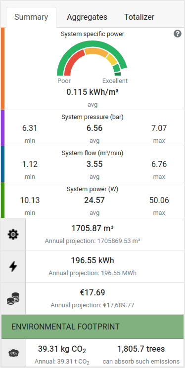
Summary page is showing system channel statistics for selected inspect period:
System efficiency is showing your system efficiency rate in % compared to the best in class system. Calculations are done based on system isentropic efficiency with gauge comparing your system to the best in class, which means that data are recalculated to average system pressure, compressed air system power power groups and air quality class.
Best in class is calculated as system Isentropic Efficiency (IE).
dark green means your system is close to theoretical best in class (>95% of IE)
light green means your system is close to best in class (>85% of IE)
yellow good average system (>70% of IE)
orange poor average system (>40% of IE)
red is very inefficient system and needs corrective action (<40% of IE)
Sensor channel or calculation error (>100% of IE)
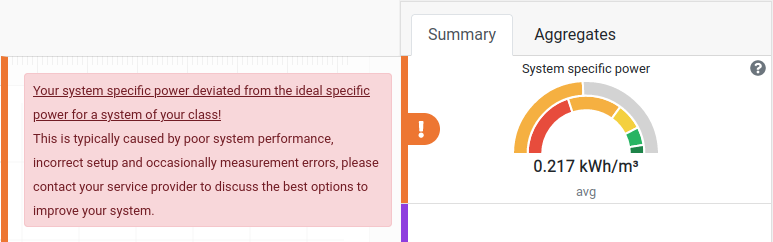
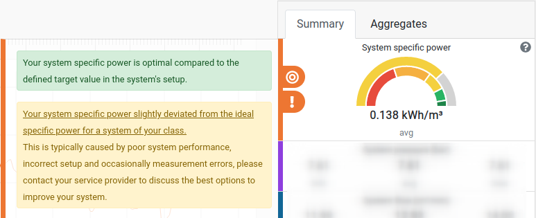
For system savings calculation always use average system specific power on Summary card - defined as quotient of average power and average flow. Do not use average specific power based on channel analysis graphs. For more info check link.
Hovering over the system specific power chart, opens a detailed comparison window with recalculated best in class and savings opportunity in % and yearly savings.
NOTE: An additional warning is displayed, based on the amount of how much your system’s specific power deviated from the ideal specific power. There are different warnings for slight and major deviations (15% and 30% from the ideal specific power), which serve as an alert to check on the system’s performance, sensor setup etc.
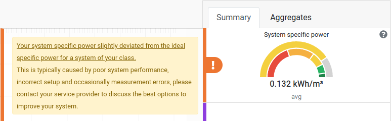
NOTE: Optimal performance is an additional informational label displayed when your system’s specific power reaches the targeted specific power indicator, as configured in the system setup menu under target page. Keep in mind that both a warning label and a successfully achieved target label can be displayed simultaneously, depending on how much the target and ideal specific power differ from each other.
System pressure min, average and max value
System flow min, average and max value
System power min, average and max value
Cumulative system volume of air and annual air consumption estimation
Cumulative system energy for a selected period and estimation for one year on an 8766 h basis
Cumulative cost for electricity for producing air in the selected period and annual cost estimation for electricity for compressed air, based on annual hours 8766 h
Environmental footprint with CO2 calculation for the selected period and annual hours 8766h
Disclaimer: Annual cumulative values are estimated based on the selected period. If you select a longer reporting period and include also an off-production period, the better will be estimation for an annual period. CALMS is using 8766 hours for annual estimation.
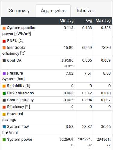
Aggregates card
This table is used for chart analysis for selected inspect period and shows cursor value, min, average and max value for each selected channel with same highlighted colour as channel plot based on selected down sample as shown on graph (may be different from measured data without aggregation)
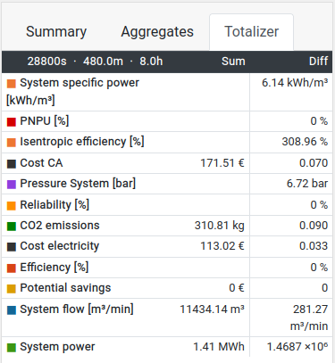
Totalizer card
This table is used for chart analysis for selected inspect period and shows sum (i.e. integral) value and absolute difference in values between starting and end point for each selected channel with same highlighted colour as channel plot based on selected down sample as shown on graph.
Aggregate
Aggregate page will show aggregated channels for energy and flow consumption based on selected inspect period and aggregation level (hour, day, week, month).
Compare to selected target specific power.
CUSUM graph
CUSUM graph displays how the system is performing in comparison to its target specific power. For each time period the difference between target specific power and actual specific power is multiplied by volume of air consumption of that time period. This gives the difference between your target and actual performance in energy consumption. The graph shows aggregate sums of this energy consumption difference.
Monitoring and targeting diagram
Monitoring and targeting diagram show each of the time periods as a data point on a energy consumption / air consumption graph and target specific power represented by a line. When a data point is below the line, it is performing better than your target specific power (it uses less power per unit of flow) and when it is above the line, it is performing worse.
Create slice
Slice is a fixed view of the collected data. It contains a set of channels or other signals, each of which has finite number of data points aimed for system detail analysis.
Analyze
This tools are build for experts for system analysis for selected inspect period called slices based on audit measurements. Typical slice duration is 1 or 2 weeks, but sometimes you want to analyse also shorter period like weekend or even 1 hour special event.
Follow steps for audit and creating final report
start temporary measurements - audit with audit box or any other device
perform live audit with customer interaction to collect all relevant events and one week typical operation data
when you are happy with measurements select slice or more slices with Analyze button (for audit at least one week must be selected)
inspect graph check for anomalies and statistical data

save all screen captures with download picture button
create audit report template under Report section and add all special sections that you want to show for the final report which can be further edited in MS Word
Experts can create their own templates and used them for next audits. Follow the Audit guide link.
Slices
Slice is a fixed view of the collected data. It contains a set of channels or other signals, each of which has finite number of data points.
Slices are used to analyze a specific time period using specialized set of tools, tables and visualizations. Slice can also be downloaded and imported into any other time-series analysis software.
Graph
Graph view is larger inspect page with more detail statistics and value interpretation for easier analysis. For detail option manual check inspect page.
Table
Table view will display measurements (all channels in the slice) with selected resolution (down sample). Channels can be organised and sorted.
Table can be also exported as CSV file - but limited to max 10MB files size (approximately 1 week of 10 channels with 1 min resolution). For higher resolution and more data, select download large tables - this process will be done in the background and let you know to download file.
Histogram
Histogram charts will show time distribution for each measured or calculated channel. Those charts are important to understand where you need to focus with optimisation. Histogram will show % of time for different channel value ranges.
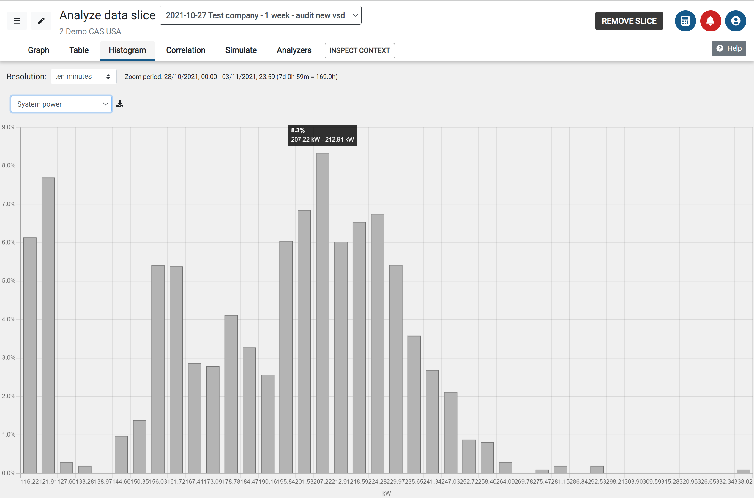
Copy and paste to report typical histogram showing flow / power ranges where analysis should focus on.
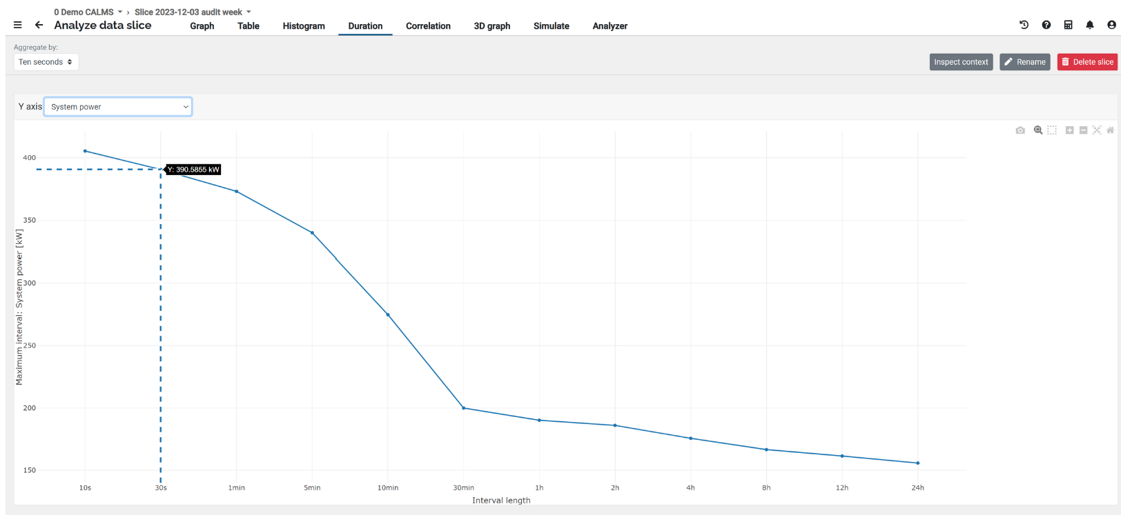
Duration
Load duration curve provides a snapshot of maximum channel value (like Power) that has been used (vertical axis) at a given time interval (horizontal use). CALMS will search in reporting period to find peak values for different time frames. It can be compared also to the highest-ever for particular system (background curve system live time compared to reporting period) in different time intervals.
The Load duration curve is useful for setting power/flow/pressure - based targets in control algorithms. With this tool, you can set realistic setpoints and targets for control optimization.
For faster response use higher aggregate (like 10min) , for more accurate and slower response use low aggregate like 10sec.
Correlation
CALMS is using scatter diagram method to show dependence or correlation between two measurement or calculated channels. On this page we have multiple tools for detail analysis and graph presentation.
- Pressure bands if you select pressure on y-axis
- linear regression
- histogram of independent channel (x)
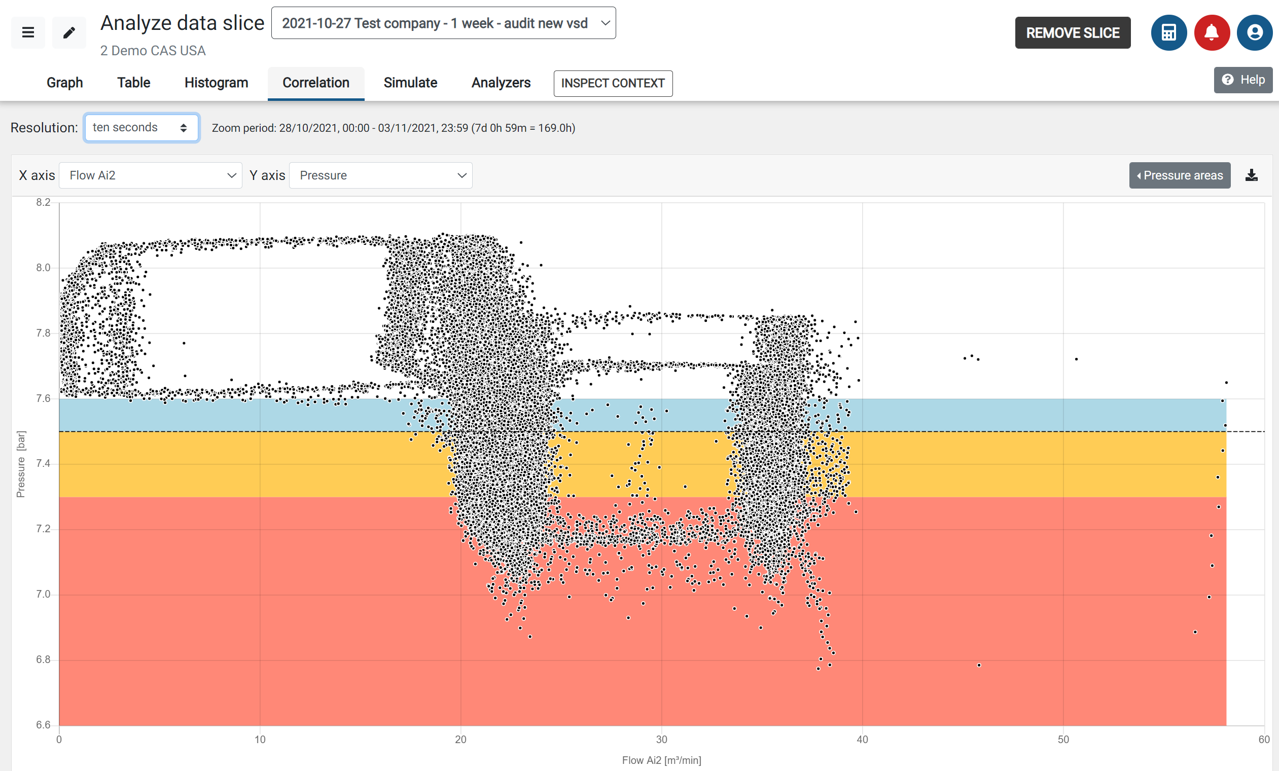
Correlation in compressed air analysis is used especially for showing relations or ranges of pure performance like specific power vs. flow or power. It will show characteristic of different types of compressors like U-curve screw compressors or L-curve for centrifugal compressors (specific power versus flow/power ).
Copy and paste to report important correlations of system like pressure vs. flow distribution or power vs. flow and specific power vs. flow or power.
Correlation together with histgram will give you an idea which ranges needs your focus for optimisation.
Linear regression
Linear regression analysis is used to predict the value of a dependent variable-channel (y) based on the value of another independent variable (x). Linear Regression is the process of finding a line that best fits the data points available on the plot, so that we can use it to predict output values for inputs that are not present in the data set we have, with the belief that those outputs would fall on the line.
The variance R2 is a measure of variability. It is calculated by taking the average of squared deviations from the mean. Variance tells you the degree of spread in your data set. The more spread the data, the larger the variance is in relation to the mean.
- Variance below 30% means channel y is hardly connected to channel x
- Variance above 95% means that channels are practically the same
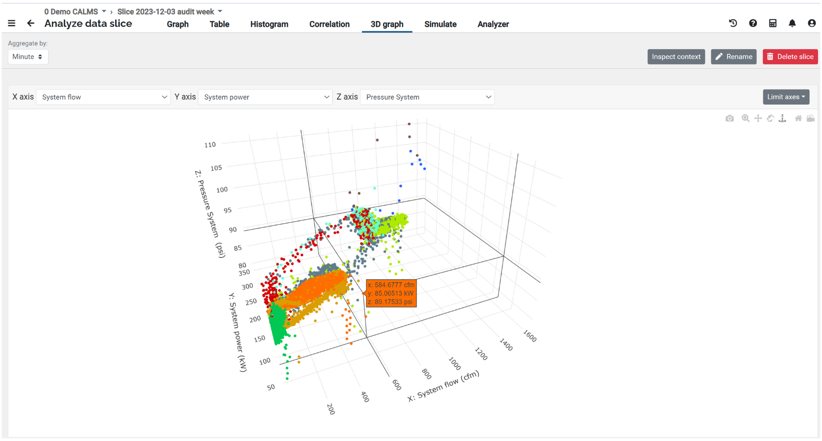
3D Correlation
CALMS is using scatter diagram method to show dependence or correlation between three measurements or calculated channels. On this page we have multiple tools for detail analysis and graph presentation based on different compressor combination
Simulate
Simulation part is very powerful tool using separate dedicated micro service to calculate savings opportunity based on different actions for system improvement like new compressor setup, new compressor installation, new master controller or pressure flow controller or bigger receiver…
The base for simulation is compressed air system model created by PI&D schematic and flow profile (real system consumption) collected by flow measurement (audit / permanent monitoring) or importing flow profile from data loggers or scada / PLC.
This is real time simulation which will calculate new system operation for every second based on flow profile and design pressure using compressor and other equipment models, showing you new graphs how system will operate.
To add new compressor you can use Fill data button from CALMS databases.
One of the most important benefit of simulating existing system with new parameters, new system controllers is to evaluate potential savings and reliability of operation (like number of starts/unloads..)
Before installing new control system read control system hints and perform system survey/audit.
Start simulation
Simulation is always based on flow profile, which can be selected on inspect page with Analyse button, which creates analysis slice. Inspect period for simulation is limited to two weeks. Typical slice based on audit is 1 week long. If necessary more slices can be created like weekends, weekdays, night shifts..
To start a simulation you have to select slice and start with new simulation. Follow the steps from 1..6
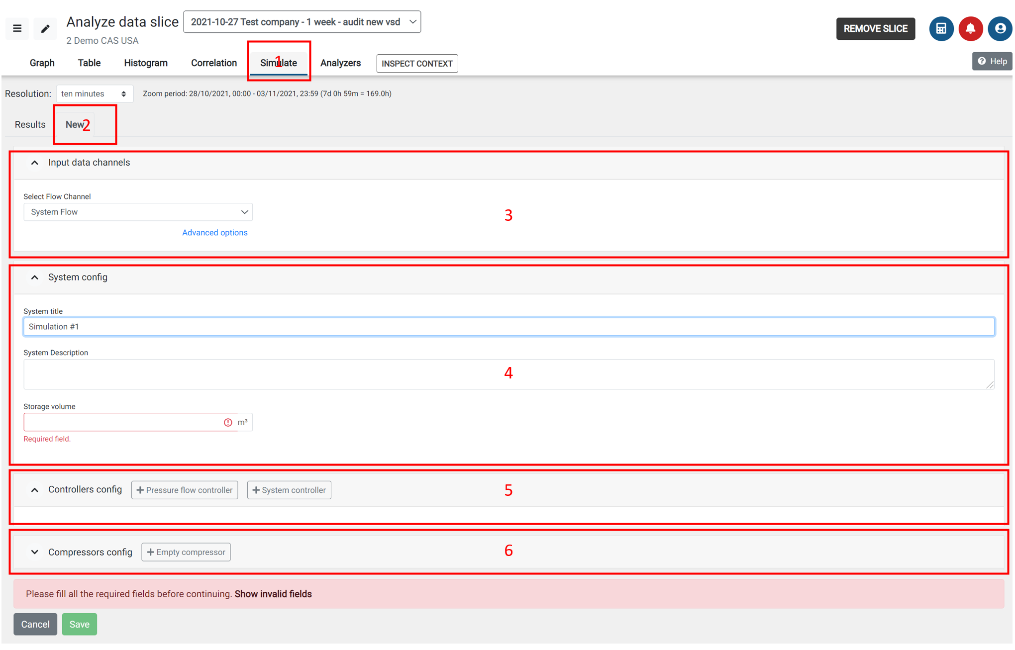
- Simulation tab based on slice
- New - start new simulation
- Input data channels - select flow channel, also calculated flow channels can be used and system flow can be changed under Advanced options with flow offset, factor and flow averaging based on system capacitance.
- System config - add simulation title, description and system storage volume
- Controllers config - add system master controller or system pressure-flow controller. System can have multiple master controllers and pressure flow controllers. For each controller select system parameters.
- Compressor config - add new empty compressor or fill compressorfrom local database or other compressor databases
System flow should be measured and recalculated based on system capacitance with flow averaging function to reflect real system demand not system production.
Controllers config
You can add one or more master control system (EMCS) or one or more system pressure flow controllers CFC).
Master control system (EMCS)
This is beta version of universal master system controller, that can be set to fit most of available controllers. Please use this fanction with CALMS support team.
Parameters for EMCS setup:
- Controler name: any name
- Set point:
Pressure flow controller
Flow profile as input for simulation
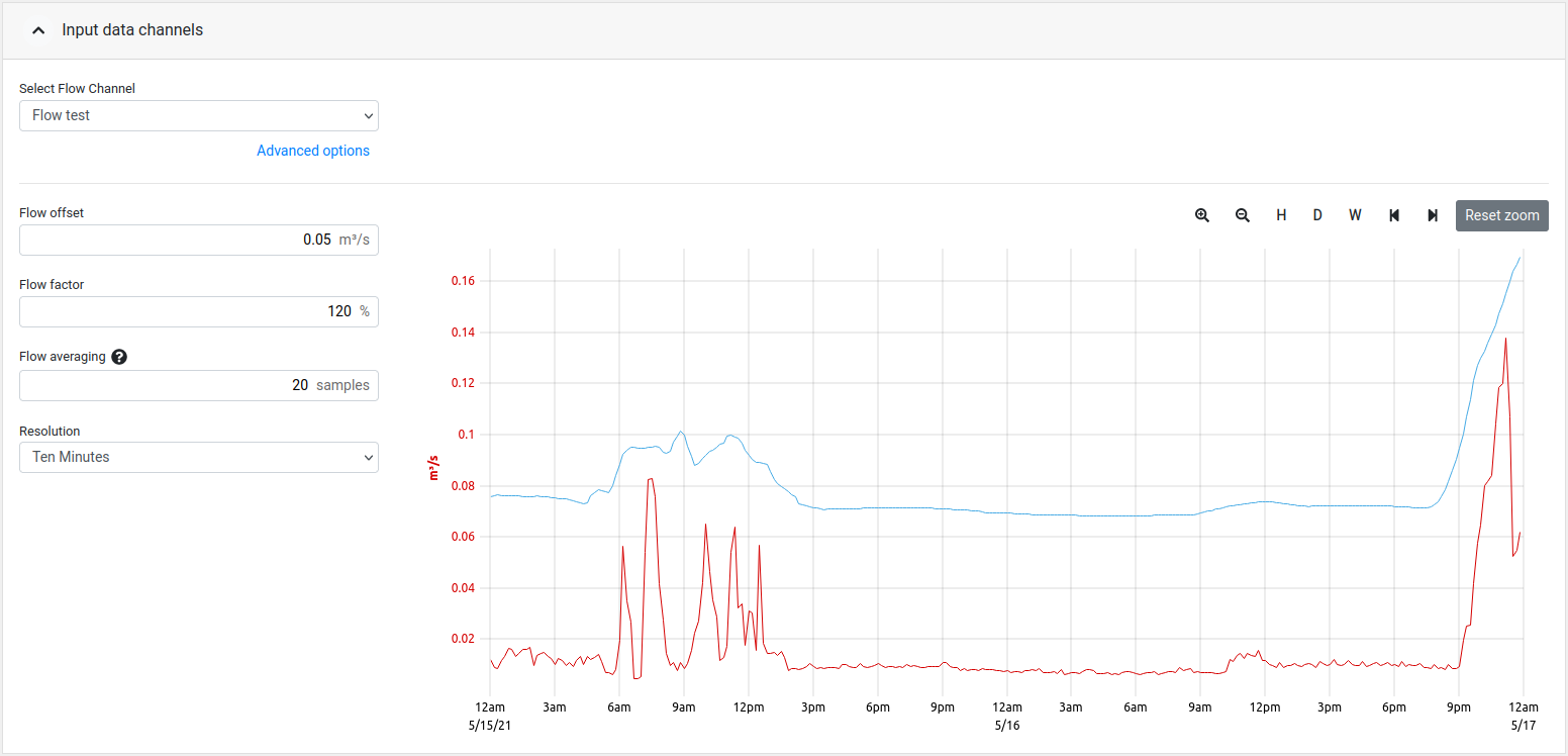
Flow offset
Modify the flow channel output with a flow constant. This function can be used if customer would like to see what will happen to the system if production changes.
Flow factor
Modify the flow channel output with a constant factor/percentage. Same function as above just using multiplier instead of fix flow value change.
Flow averaging
Flow averaging or rolling average represents number of samples with duration of 1sec or time that system can hold the pressure without compressor (System capacitance). This is especially important when you do simulation based on measured flow profile, where it is essential that you do simulation on flow that is equal to demand not actual air production (like compressor generated flow).
Resolution
This is an additional flow configuration that affects the flow averaging. Changing this will change the resolution at which that data points are shown.
NOTE: Keep in mind that selecting a high resolution on larger slice periods will download big amounts of data and may take a while to load and may or may not slow down your computer.
Simulation Results
On simulation results page you can compare different simulation results based on specific power, energy cost and % savings, with detail simulated graphs, that will show how new system will operate.
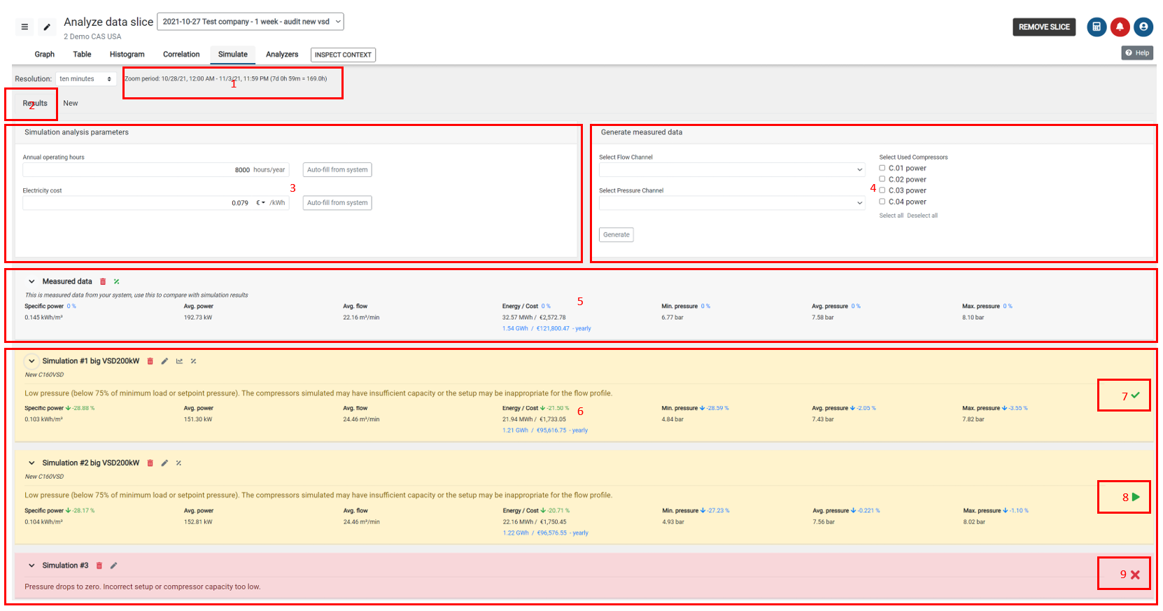
Simulation period
Results - page where you can see simulation results
Simulation analysis parameters - annual operating hours and electricity cost, you can use system default values or play with different values
Generate measured data - based on flow and pressure profile with existing compressors, simulator will show measured data
Measured data - measured data are used to compare new simulated results with measured data
Simulation results - yellow simulations are good, red simulations are not good because of many reasons like design pressure will be too low, compressors are too small…
Simulation results have 3 levels
- simulation name with buttons : more data, delete, edit, show chart, compare with
- main results: Specific power, avg.power, flow, energy with cost of energy and pressure (min, avg., max)
- compressor operation results: avg.power, #starts, #loads, %of operation
- chart with simulated graphs
Simulation is ok
Start simulation button - with this button you can run new simulation or existing one
Simulation is bad
Copy simulation results and use them in the report.
Analyzers
Analyzers are a toolbox of different functions similar to calculators but based on measurements (slices). New analyzers are added and improved on a regular basis. Currently available analyzers are:
- System capacity - capacitance of the system
- Compressor combinations - based on flow / power profile
- On-Off compressor analysis - runs an analysis of an on-off compressors power usage and efficiency
- VSD compressor analysis - runs an analysis of a vsd compressors power usage
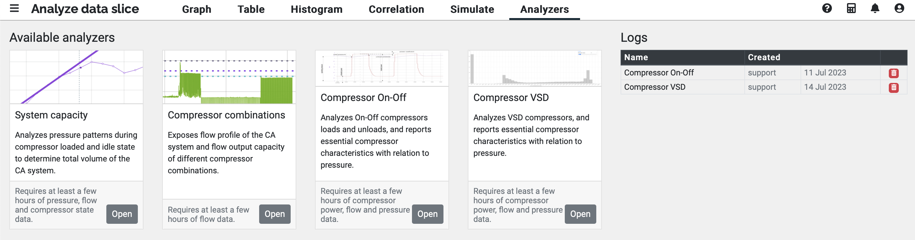
System capacity
Analyzes pressure patterns during compressor loaded and idle state to determine the total volume of the system.
Compressor combination
Exposes flow profile of the system and flow output capacity of different compressor combinations.
On-Off compressor analysis
Analyzes each on-off compressors power usage data, detects its loaded, unloaded, off and idle states, and finds the compressors properties and analyzes its efficiency based on power needed to produce a difference of one bar of pressure. 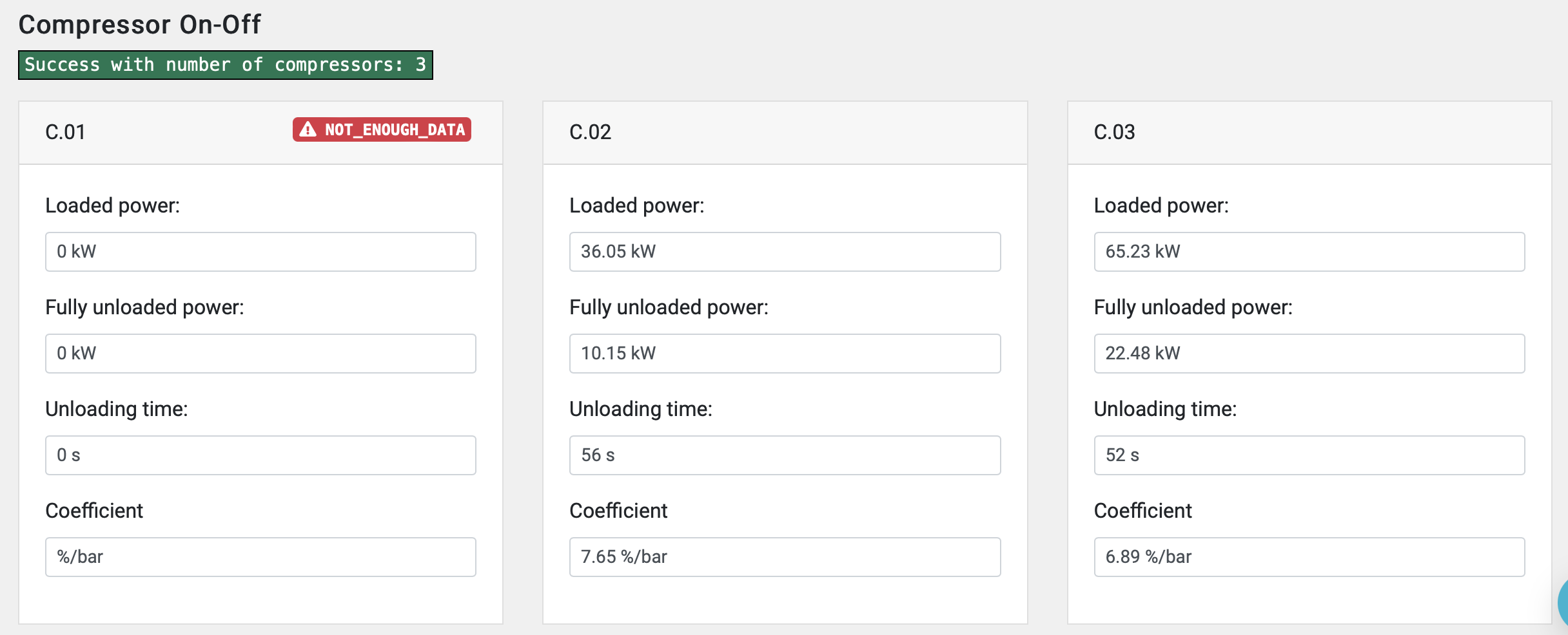
VSD compressor analysis
Analyzes each VSD compressors power usage data, detects its loaded max and min states, and reports the power usage curve characteristics. 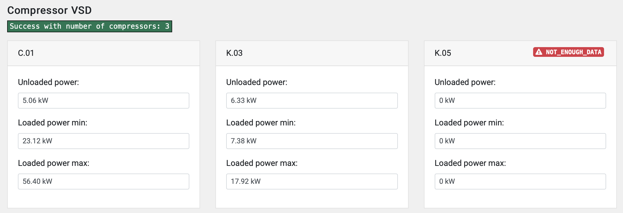
Manual entry
Manual entry is used for adding channel values manually or importing excel or csv format data measured with external data-loggers. This function can be used also to correct false or missing data (faulty sensor, electricity drop..)
Manual entry is needed for monitoring production and calculating specific consumption per unit of production as one of very important indicator.
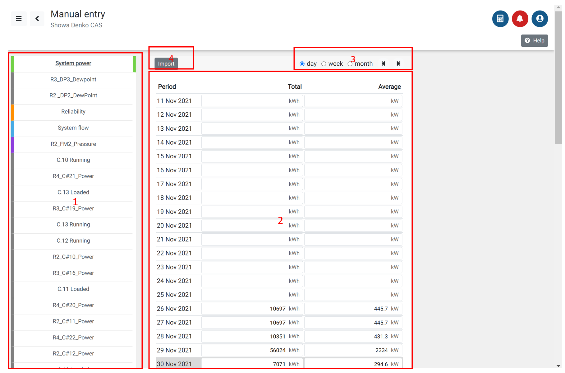
Select channel - channel where you will add manual data
Enter manual data : average value or total cumulative value distributed evenly in selected interval
Select period for which you want to enter manual data (day/ week/ month)
IMPORT - import data from external data logger or some other information system in CSV format
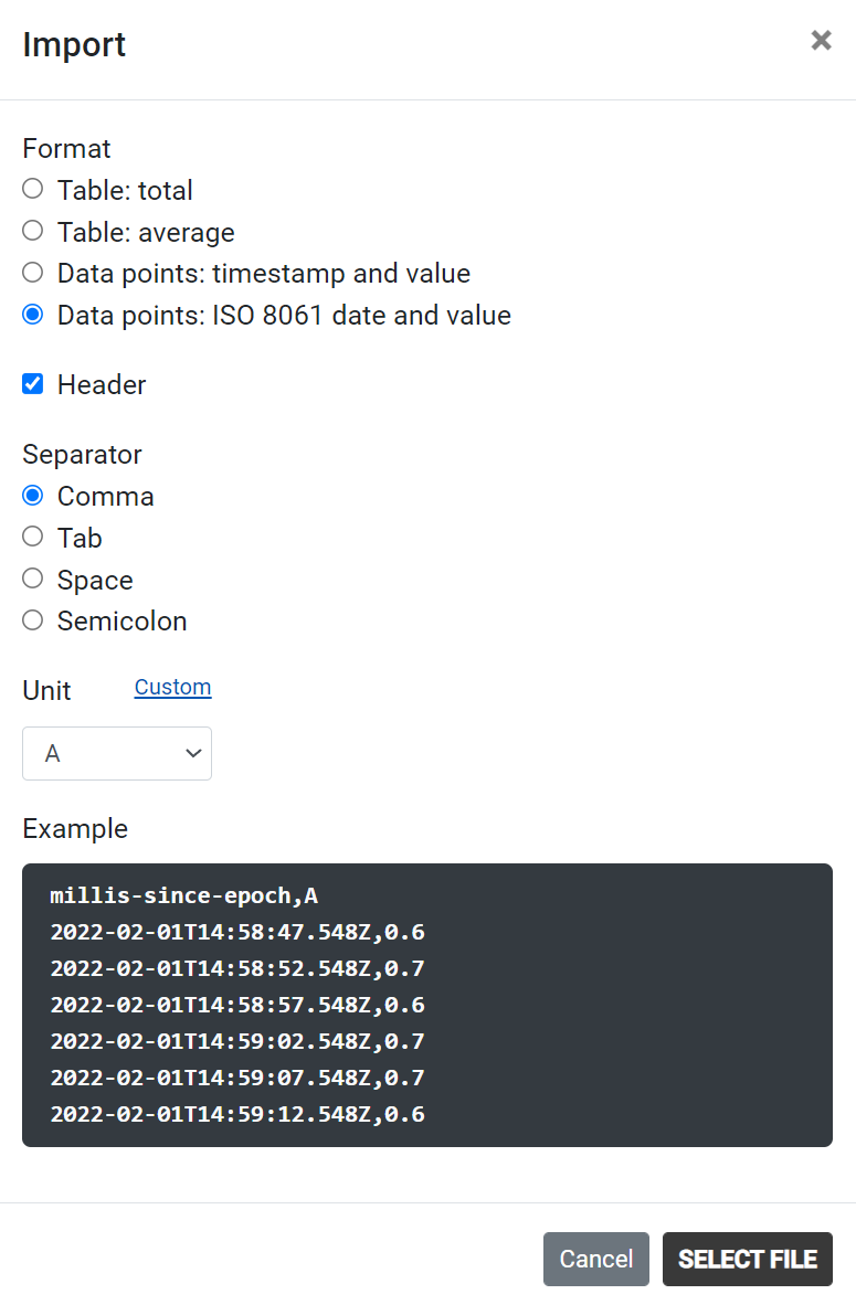
IMPORT FROM CSV
prepare CSV in ISO 8061 format
Excel command: =TEXT(A1+B1,“yyyy-mm-ddThh:MM:ss”)
where
A1: date
A2: time
Save as CSV UTF format, comma separated
Check in Notepad that file has correct format:
2021-07-09T00:00:00,140
2021-07-09T00:00:03,134.75
Select channel or create new channel and with IMPORT button and select file to upload to selected channel
Data can be uploaded not older than 3 month from time of download.
File size limit is 6MB